
By John Ross
The US is fighting the trade war against China on two fronts.
· The first is the US external economic attack on China, primarily centred at present on tariffs. This is designed by US policy to create objective economic problems for China.
· The second is the US attempt to influence international debate. This is trying to use US propaganda to spread an entirely false view of the international situation and in particularly of the real state of the US economy.
The most central propaganda falsification on this second front is to attempt to present a view of the US economy as undergoing ‘very strong’ growth. The aim of this propaganda falsification is to attempt to claim that it is pointless for China or other countries to resist the US due to the latter’s economic ‘dynamism’ – and therefore that China should accept the Trump administration’s trade demands and also abandon its socialist model of development in favour of the ‘dynamic’ US one.
This US propaganda claim of ‘strong growth’ is in fact the reverse of the facts. The reality is that far from US growth under Trump being ‘strong’ it is in fact the lowest under any US President since World War II!
The aim of this article is therefore factual, to lay out in detail the factual realities of the US economy under the Trump administration – it therefore follows the Chinese dictum of ‘seek truth from facts’.
But establishing these facts is critical for judgement of the situation in the trade dispute with the US. The US is attacking China not because of ‘dynamic’ US growth but because US growth has fallen to such a low level by historic standards.
The entirely false economic claims of Trump
When President Trump claimed in his speech to the UN General Assembly on 25 September that, ‘America’s economy is booming like never before,’ and that, ‘in less than two years, my administration has accomplished more than almost any administration in the history of our country,’ the delegates literally broke out into laughter – as US media reported. The Washington Post headlined its report: ‘”People actually laughed at a president”: At UN speech, Trump suffers the fate he always feared.’ The UK Financial Times similarly noted: ‘President Trump prompted laughter and gasps.’
As Trump’s claim the US economy is ‘booming like never before’ is simply entirely untrue, as was his earlier one that growth under his presidency was ‘historic’, by which he meant historically high, it is therefore rather astonishing to see similar claims repeated in parts of China’s media. The reality is that under Trump, far from the US undergoing ‘strong recovery’, it is experiencing the slowest economic growth in any business cycle, and during any presidency, since World War II. As this article will show, the only sense in which economic growth under president Trump is ‘historic’ is in the sense that it is ‘historically low’.
US Post-War Business Cycles
To start with the most comprehensive data on US post-World War II economic performance, Figure 1and Table 1show the data for growth in all US business cycle since World War II. Table 1shows these eight US business cycles since World War II in chronological order – a business cycle is defined as the period between two recessions and a recession is defined, in the standard US manner, as two successive quarters of negative growth. As business cycles are of different lengths the key statistic for comparison is the average annual growth rate during the cycle – shown in the last column.
The feature which stands out from this data is clearly how much slower US growth is during this business cycle than it than in any previous one since World War II. To give a comparison to evaluate Trump’s claim regarding ‘historic’ fast growth, the most rapid annual average economic growth in any post-World War II US business cycle was in 1948-1953 at 4.7%. That was more than three times as fast as the 1.5% during the current business cycle. Indeed, it may be seen that in all previous US post World War II business cycles growth was faster than in the present one.
Looking in Figure 1, at the end of the growth line for the present post 2007 business cycle, it can also be immediately seen that there is no significant acceleration during the Trump presidency – this will be demonstrated in detail below.


Detail
In order to show the trends in the post-World War II economy more clearly and in greater detail Figure 2sets out growth in US business cycles since World War II in descending rank of growth rate rather than chronological order. This shows the following clear pattern.
· The fastest annual average economic growth in any post-World War II US business cycle was in 1948-1953 at 4.7%
· The second highest annual average growth in any US post-World War II business cycle was in 1957-1969 at 4.3%
· The third highest annual average growth in any US post-World War II business cycle was 3.4% in 1969-1973.
· The fourth highest annual average growth in a US post-World War II business cycle was in 1980-1990 at 3.1%.
· The fifth highest annual average growth in any US post-World War II business cycle was 3.0% in 1990-2007.
· The sixth highest annual average growth in any US post-World War II business cycle was in 1973-1980 at 2.9%.
· The seventh highest annual average growth in any US post-World War II business cycle was 2.5% in 1953-1957.
· The slowest annual average growth in any US post-World War II business cycle was in the cycle from 2007 to the present, the latest data being for the 2ndquarter of 2018 – with an annual average growth rate of only 1.5%.
Figure 2 therefore shows clearly how much slower growth is in the present US business cycle than in any previous one since World War II. The claim that that the US is undergoing ‘dynamic growth’, due to rapid technological innovation or to Trump, is the exact reverse of the truth. What is striking about the present situation of the US economy is how slow its growth is compared to all previous post-World War II US business cycles

Growth under Trump – the US method of measurement
So far growth during US business cycles has been analysed. But the Trump presidency covers only a part of the present US business cycle – this business cycle has also been proceeding under the presidencies of George W Bush and Obama. Therefore, to compare presidencies, it might be claimed that growth under Trump is fast, whereas that under George W Bush and Obama was weak. But, once again, the facts show the exact opposite – it is growth under Trump which stands out as weak.
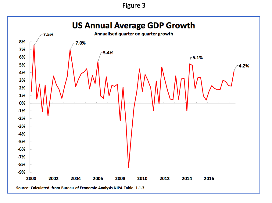
To show this Figure 3illustrates US GDP growth during the 21stcentury measured by the method by which the US publicises its economic data – i.e. quarter on quarter GDP growth annualised (for example growth in the 2ndquarter of 2018 compared to the 1stquarter of 2018 annualised). Figure 3shows that using this measure:
· In the last period of the Clinton presidency peak US growth reached 7.5% in the second quarter of 2000 – the fastest growth under the Clinton presidency.
· Under George W Bush there were successive peaks of growth of 7.0% in the 3rdquarter of 2003 and 5.4% in the 1stquarter of 2006.
· Under Obama peak growth was 5.1% in the second quarter of 2014.
· Therefore, the peak growth under Trump of 4.2% in the 2ndquarter of 2018, is slower not merely than under Clinton but also slower than under George W Bush and Obama during the present business cycle.
Real US year on year growth
It was demonstrated above that even taking the method by which the US choses to publicise its data growth under Trump is slower than under Obama, George W Bush and Clinton. However, there are significant problems in the way that the US publicises its GDP data – i.e. by annualising quarter on quarter growth. This is because:
· First, as only a three-month period is used, short-term factors distort the data.
· Second, because such short-term factors are approximately multiplied by four their effect is magnified[1]. This results in the peak growth rates achieved under all US presidents measured by the US method being exaggerated – Clinton never actually achieved 7.5% growth over a whole year, George W Bush never achieved 7.0% growth over a whole year etc.
· Third, because different quarters are being compared a seasonal adjustment calculation has to be made which must be accurate for the data to be correct. But in the US it is generally known this seasonal adjustment is inaccurate – the first quarter growth in each year is understated, meaning growth in following quarters is exaggerated.
This method of China of publicising economic data is more robust than that of the US. China highlights the real year on year economic growth rate – that is it compares GDP in one quarter with GDP in the same quarter of the previous year (e.g. the second quarter of 2018 is compared with the second quarter of 2017).
China’s method of presenting GDP data is more robust for two reasons.
· First, a year is a sufficiently long period to eliminate the influence of purely short-term factors – such as the weather.
· Second, no seasonal adjustment need be calculated as the same quarter is being compared in each year.
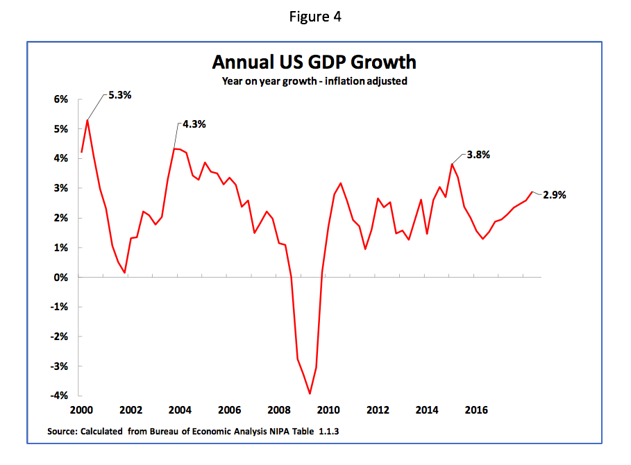
Figure 4therefore shows the real US year on year growth rate achieved in different quarters during the 21stcentury. It may be seen that this immediately lowers the growth rates shown using the US method of presenting data that was given in Figure 3(for example, the actual peak year on year growth achieved by Clinton was 5.3%, not 7.5%). While the growth data calculated by real year on year growth are more realistic than the US method of publicising data, nevertheless it shows exactly the same pattern of the extremely weak peak growth of the US economy under Trump compared to previous presidents in the 21stcentury. More precisely
· Peak real year on year US growth under Clinton was 5.3%.
· Peak real year on year US growth under George W Bush was 4.3%.
· Peak real year on year US growth under Obama was 3.8%.
· Peak real year on year US growth under Trump is only 2.9%.
Once more it is therefore clear that what is striking about growth under Trump is not how fast it is but how slow it is.
US economic growth under Trump is the slowest under any US President since World War II.
So far, in comparing growth under US presidents, only those in the 21stcentury have been analysed. But the comparison becomes even worse for Trump if all US President’s since World War II are compared. Indeed, the extraordinary situation may be seen that peak growth under Trump is the slowest for any US president since World War II.
To demonstrate this Table 2and Figure 5shows peak growth under all 13 US Presidents since World War II. This data is shown in the way that the US itself choses to headline economic growth – one quarter’s growth compared to the previous quarter at an annualised rate. This data then shows clearly that peak economic growth under every previous post-World War II President was higher than under Trump.
In more detail, Table 2shows that, using the US method of presenting data, the peak growth under Trump of 4.2% in the 2ndquarter of 2018 was significantly lower than the maximum growth under the previous Obama administration of 5.1%. However, this peak under Obama was itself far lower than under former US Presidents. In addition to peak growth under Trump being lower than under Clinton, George W Bush, and Obama, as was already analysed, earlier Presidents achieved even higher growth rates – such as 10.3% under Nixon. Peak US post-World War II growth was achieved under Truman at 16.7% – almost four times as fast as the 4.2% under Trump.
It is therefore clear that in terms of peak growth rate, measured by the way the US presents data, Trump ranks last, 13thout of 13, of US post-war presidents.


Real year on year US economic growth
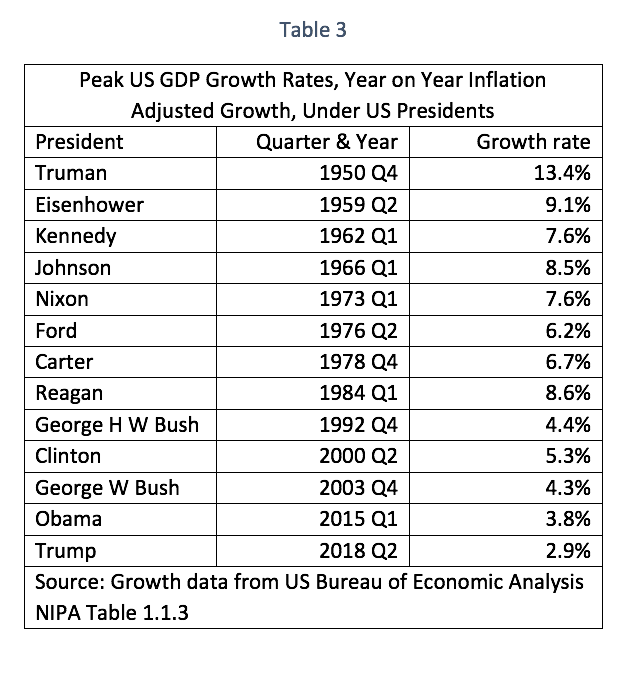
To double check the situation, it may again be recalled that the US presents its data in a different way to China. Having already given the results using the US method, Table 3and Figure 6therefore shows real year on year peak growth under all US presidents since World War II. This shows that also calculated by this method the peak year on year GDP growth under Trump, at 2.9% in the second quarter of 2018, is the lowest under any US president since World War II.
It was already noted that peak growth under Trump of 2.9% was lower than under Obama (3.8%), George W Bush (4.3%), and Clinton (5.3%). But Trump’s peak growth rate was also lower than under George H W Bush (4.4%), Ford (6.2%), Carter (6.7%), Nixon (7.6%), Kennedy (also 7.6%), Johnson (8.5%), Reagan (8.6%), Eisenhower (9.1%), and Truman (13.4%).
Therefore, whether growth is calculated according to the method used by the US, or that used by China and most other countries, peak growth under Trump is the lowest of all of the 13 US presidents since World War II. What is therefore striking is not that US peak growth under Trump is fast but that it is so slow in terms of historical comparisons.

The state of the US business cycle
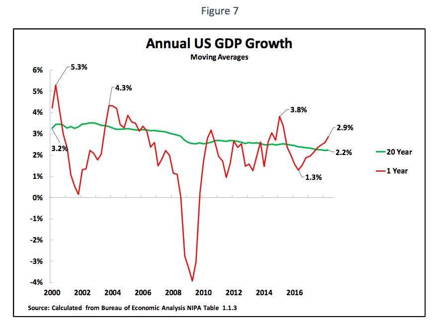
Finally, given that peak US economic growth under Trump is slower than under any previous post-World War II US president, the only reason President Trump is able to make his entirely false claims of ‘historic’ growth is by comparison to the extremely poor performance of the US in 2016 when US growth fell as low as 1.3% in the second quarter – shown in Figure 7. But Figure 7equally shows that both the downturn in the US economy in 2016 and the recovery since then, were perfectly normal fluctuations within the US business cycle.
Analysing this trend in the US business cycle detail, it may be seen that the current long-term average of US real year on year growth is 2.2%. However, naturally, there are fluctuations above and below this. To give a rough approximation of the magnitude of these fluctuations, as the 1.3% growth in US GDP in the second quarter of 2016 was 0.9% below the long-term average then, merely to maintain the average, a 0.9% oscillation above the average might be expected. The long-term average of 2.2% plus 0.9% would be 3.1%. There is, therefore, nothing abnormally high in US growth in the second quarter of 2018 being 2.9%.
Trump’s claims on rapid growth therefore merely represent a normal fluctuation in the business cycle and in no way alter the fact that peak growth under his presidency is lower than under any US president since World War II.
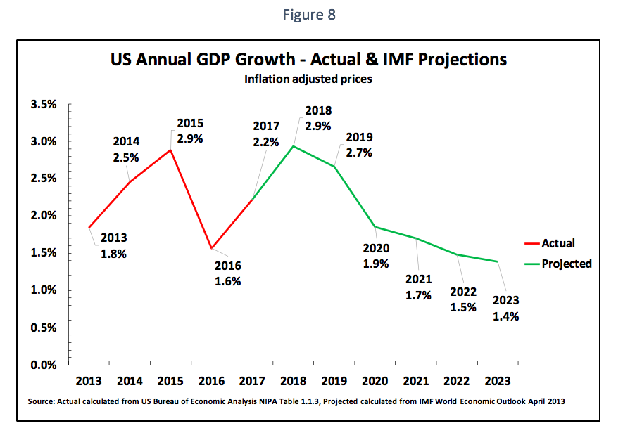
Furthermore, there is a clear implication of the fact that even the slow peak growth under Trump is simply a normal upward oscillation in the US business cycle. This is that this will be followed by a perfectly normal downward oscillation in the business cycle. Indeed, this is precisely what is predicted not only by the long-term averages of US growth shown above but as is predicted by the IMF. As Figure 8shows the IMF projects that after extremely poor US growth of 1.6%, for the whole of 2016, US growth will accelerate to 2.9% in 2018. After this, however, US growth will decelerate to 1.9% in 2020 and 1.7% in 2021 – this would represent a perfectly normal oscillation in the US business cycle.
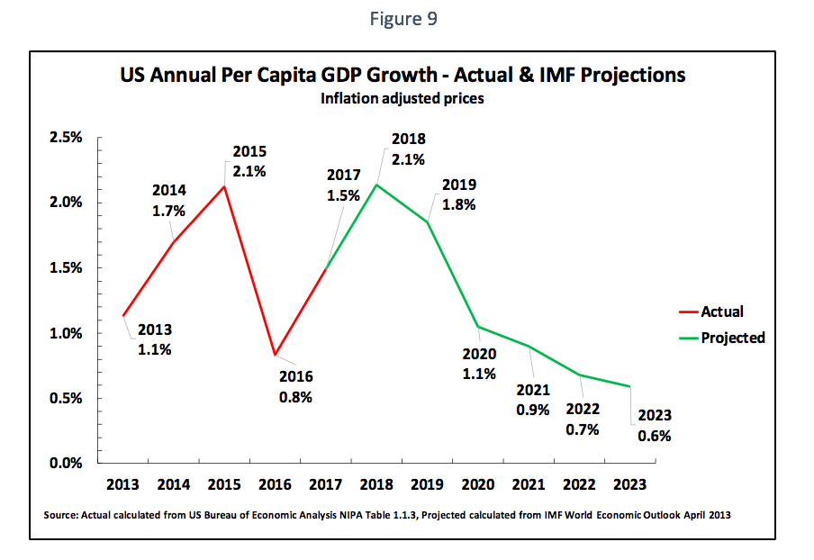
To understand the impact of this trend on US domestic politics it is important to note that the US has a relatively fast rate of population increase – 0.7% in 2017. Figure 9 therefore shows both the actual increase in US per capita GDP to 2017 and the IMF’s projections for the increase in US per capita GDP after this. As may be seen, the IMF projects annual US per capita GDP rising to 2.1% in 2018 before falling to 1.1% by 2020 and only 0.9% by 2021.Therefore, the increase in US output per person is actually significantly below the US total GDP increase. Furthermore, due to rising US inequality, the increase in actual real incomes of the majority of the US population is lower even than the increase in per capita GDP.
With such a slow increase in per capita GDP it is evident that current domestic political tension and instability in the US will continue – as has been seen in the sharp internal US political clashes since 2016.
Conclusion
There are numerous consequences internationally and for US domestic politics of the very slow growth of the US economy under Trump compared to previous US post-World War II presidents. However, the precondition for analysing these implications is to establish the facts – which is the purpose of this article.
These facts leave no doubt. Peak growth under Trump is the lowest for any US president since World War II, and US growth in the present business cycle is the slowest in any since World War II. In summary, US policy is determined by how slowly its economy is growing by historic standards.
The starting point for any serious analysis of the Trump administration must be how slow its economic growth is compared to previous US post-World War II presidencies. Once that is done then the features of the Trump administration’s policies become clear.
* * *
The Chinese language version of this article was originally published by New Finance on 6 October 2018.
[1] Strictly speaking the annualization is carried out by ((1+g)^4)-1) where g is the growth between one quarter and the next.
The above article was published first in English by New Cold War.


Recent Comments