Uncategorized

Did austerity lead to recovery? No, GDP was increased by government spending

Did austerity lead to recovery? No, GDP was increased by government spendingBy Michael Burke

The government and its supporters have been quick to claim that the most recent GDP data have vindicated its austerity policy. George Osborne says the argument in favour of austerity has been won some more excitable commentators have even talked of a boom.

Usually, SEB would provide analysis of the GDP data after the publication of the national accounts, the third release in the cycle from the Office of National Statistics, which provides a detailed breakdown of the components on economic activity and the final revision to the data.

But the claims made for the British economy following the most recent GDP release (and some subsequent surveys) are so outlandish, and so at odds with the facts, that is worth providing a short analysis now.
The data is still partial and subject to revision. But there is enough evidence to demonstrate factually that the weak recovery is not a reward for austerity, but is in fact entirely a function of increased government spending.

The economy has expanded by just 1.8% in 3 years of austerity, an annual rate of 0.6% which is less than one-quarter of previous trend growth. The gap between the current level of GDP and trend growth for the British economy is widening. In addition, the growth to date is entirely a function of increased government spending.

Factual Analysis

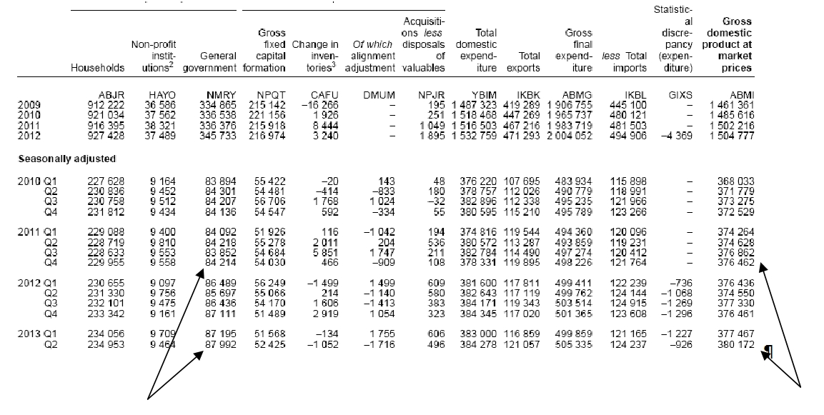
This verdict is so at odds with both stated government policy and the overwhelming commentary on the latest data. Therefore it is important to provide the hard evidence supporting this analysis. The can be found on Table C2 of the latest release, Second Estimate of GDP, Q2 2013 (ONS).

Total government current spending was barely changed from the time the Coalition took office to the end of 2011. (In the ordinary course of events real government spending should rise in line with population growth and in a recession should rise much faster to offset the effects of recession. Unchanged government spending represents a harsh ‘austerity’ stance).

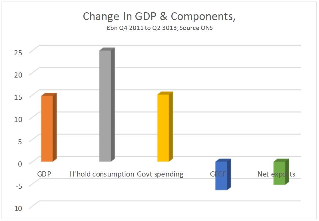
However, from the 4th quarter of 2011 to the 2nd quarter of 2013 government current spending has risen decisively by an annualised £15.1bn. GDP did not begin to expand until two quarter later. This is the time lag SEB has previously identified in the relationship between changes in government spending and changes in GDP. Rising government spending has led the recovery.

While the increase in government spending since the 4th quarter of 2011 to the most recent quarter amounts to £15.1bn, the rise in aggregate GDP over the same period is just £14.8bn. Therefore, the rise in government spending not only led the recovery, but more than accounts for the entire expansion over the same period (as some other components of GDP have contracted).

Rising government current spending tends to support consumption, which is exactly what has happened over the last 18 months. The rise in household consumption has been the strongest of all components of GDP over that period, rising by £25bn. The chart below shows the changes in the national accounts since the government began increasing its current spending after the 4th quarter of 2011.

Fig 1

But weak household spending is not the source of the crisis. This remains the slump in investment. GDP is still £50bn below its previous peak in the 1st quarter of 2008, but investment (Gross Fixed Capital Formation) is £65bn lower. Household consumption also remains below £24bn its pre-recession peak. But it has been rising continuously for 2 year and now accounts for under half of the total decline in GDP. The fall in GFCF more than accounts for the entire fall in GDP.

It is not possible from the partial release of the data for the 2nd quarter of 2013 to establish the role of government in the continuing investment strike. But from the 1st quarter national accounts, it is clear that declining government investment has been exacerbating the private sector decline in investment. Government investment peaked under the last Labour government and has been cut continuously ever since.

But the analysis is confirmed by the separate ONS data on public finances. The presentation of the public finances data vary significantly from the presentation of government consumption data in the national accounts. Among the many differences is that the former are presented in nominal terms only. Even so, these show (Table PSF5) that in nominal terms the level of departmental outlays rose to £305bn in the first half of 2013, from £283bn in the same period of 2012. This is a rise of 7.8% and way above the rate of inflation.

Conclusion

There is no mystery to the current very weak recovery. It is led by a moderate increase in government spending, which more than accounts for the entire increase in GDP over the same period.

This runs counter to the government’s stated ‘austerity’ policy. But it is accompanied by a cut in government investment, which exacerbates the private sector investment strike. It is this investment strike which remains the source of the crisis, which cannot be resolved by increasing current spending.

Logic would dictate that any government which wanted to support the economy would increase investment, which is the source of the crisis. Conversely, any government fixated on deficit reduction would probably be inclined to cut both current and capital spending.

This government is committed to neither economic recovery nor deficit-reduction. Instead, it is committed to boosting profits. That is why it is willing to increase current spending which supports consumer demand but refuses to increase investment as this would displace private capital from potentially profitable sectors of the economy.

Since this government is not sticking to its own spending plans, it makes even less sense for an incoming Labour government to do so. Instead, it needs to address the source of the crisis by increasing state investment.

Fig. 2

China has overtaken the US to become the world’s largest industrial producer

China has overtaken the US to become the world’s largest industrial producer

By John Ross

The period since the international financial crisis began has for the first time in over a century seen the US displaced as the world’s largest industrial producer – this position has now been taken by China. It has also witnessed the greatest shift in the balance of global industrial production in such a short period in world economic history. In 2010 China’s industrial output exceeded the US marginally but this has now been consolidated into a more than 20% lead with the gap still widening further.

In 2007, on UN data, China’s total industrial production was only 62% of the US level. By 2011, the latest available comparable statistics, China’s industrial output had risen to 120% of the US level. China’s industrial production in 2011 was $2.9 trillion compared to $2.4 trillion in the US – this data is shown in Figure 1.

Figure 1
13 08 25 Chart 1 US & China Industrial Production

When the comparable data is released for 2012, China’s lead will have increased substantially– between December 2011 and December 2012 China’s industrial output increased by 10.3% whereas US industrial production increased by only 2.7%. Calculations based on estimates in the CIA’s World Factbook indicate in 2012 the value of China’s industrial production was $3.7 trillion compared to $2.9 trillion for the US – which would mean China’s industrial production was 126% of the US level.

Taking only manufacturing – that is excluding mining, electricity, gas and water production – in 2007 China’s output was 62% of the US level, by 2011 it was 123%. Again the gap has widened in 2012 and 2013.
No other country’s industrial production now even approaches China – in 2011 China’s industrial output was 235% of Japan’s and 346% of Germany’s.

World Bank data, using a slightly different calculation of value added in industry, confirms the shift. On World Bank data China’s industrial production in 2007 was only 60% of the US level, whereas by 2011 it was 121%.

Therefore in only a six year period China has moved from its industrial production being less than two thirds of the US to overtaking the US by a substantial margin. If China was the ‘workshop of the world’ before the international financial crisis it is far more so now.

The trends producing such dramatic shifts in such a short period are shown in Figure 2. In six years China’s industrial output almost doubled while industrial production in the US, Europe and Japan has not even regained pre-crisis levels. To give precise statistics, between July 2007 and July 2013 China’s industrial production increased by 97% while US industrial output declined by 1%. Industrial production data for July is not yet available for the EU and Japan, but between June 2007 and June 2013 EU industrial output fell by 9% and Japan’s by 17%.

Figure 2
13 08 25 Chart 2 China & Advanced Industrial Production

It is this enormous rise in China’s output which also drove the much discussed global shift in industrial production in favor of developing countries – in the six year period to June 2013, the latest date for which combined data is available, industrial production in advanced economies fell by 7% while output in developing economies rose by 65%.

As is clear from Figure 3, China accounted for the overwhelming bulk of the increase in the developing economies. Industrial production in Latin America rose by 5%, in Africa and the Middle East by 6%, and in Eastern Europe by 10%. But China’s industrial production in this period rose by 100% – industrial output in developing Asia as a whole rose by 65%, but the majority of this was accounted for by China.

Figure 3

13 08 25 Chart 3 Advanced & Developing Industrial Production


The quite literally historic scale of these shifts makes clear that by far the most important development in world industrial production in the last period is this extraordinary rise of China. Between 2007 and 2011 China’s industrial production rose by $1,465 billion, in current prices, while US industrial output rose by only $88 billion in current prices and declined slightly in inflation adjusted terms. China’s industrial production rose by 17 times as much as the US.

Such a rise in China’s industrial production has consequences spreading far beyond industry itself. Industry has easily the most rapid increase in productivity of any economic sector – notably compared to services. The decline of industrial production in the EU and Japan, and relative stagnation in the US, means China is cutting the productivity gap between itself and the advanced economies. This is crucial for progress in raising China’s relative GDP per capita and living standards.

This rising productivity also explains why China’s exports have been able to maintain their competitiveness despite substantial increases in the exchange rate of China’s currency the RMB. On Bank for International Settlements data, the RMB’s nominal exchange rate rose by 25% between July 2007 and July 2013. But China’s real effective exchange rate, that is taking into account the combined effect of the nominal exchange rate and inflation, rose by 31% But despite this major currency revaluation China’s exports continued to exceed its imports.

The ability of China to successfully absorb such high increases in its exchange rate, due to high levels of industrial productivity increases, directly translates into relatively lower prices for imports and improved relative living standards for China’s population.

This data also settles the dispute between who believed there was a major industrial revival in the US, such as the Boston Consulting Group, and Goldman Sachs and other analysts who correctly concluded no such major revival has occurred. Those in China, such as Lang Xianping, who wrote that a great US industrial revival was taking place and China’s industry was in crisis look foolish in the light of data showing China’s industrial output doubled in a period when US industrial production did not grow at all. The only reason US industrial performance does not appear very weak, with negative net growth over a six year period, is because of the even worse performance of a major decline in industrial output in the other advanced economic centers – the EU and Japan.

It is naturally important not to exaggerate this scale of advance by China in industrial production. China’s industrial output is now considerably larger in value terms than the US, but the United States retains a substantial technological lead which it will take China a considerable period to catch up with. Due to a long period of globalization and consolidation by US companies, both processes which are only at early stages in China, US manufacturing firms are still four times the size of China’s in terms of overall global revenue– although between 2007 and 2013 Chinese manufacturing firms overtook Germany to become the third largest manufacturing companies of any country.

The scale of these changes in world industrial production also make clear that in comparison to developments in China gas and oil ‘fracking’ in the US, which have attracted widespread media attention, is merely a statistical sideshow – as already noted overall US industrial production has not even recovered to pre-crisis levels.

For the first time for over a century the US has been definitively replaced as the world’s largest industrial producer. Such a once in a century shift can literally only be described as historic.


This article originally appeared in Key Trends in Globalisation

Britain can increase investment by slashing military spending

Britain can increase investment by slashing military spendingBy Michael Burke

The momentous decision by Parliament on August 29 not to participate in a military attack on Syria raises important points both for the trends in British politics and for economic policy.

SEB has repeatedly argued that there is no prospect of a Tory election victory in 2015. After the failure of Cameron’s military agenda the certainty of a Tory loss has become the possibility of an electoral rout. In politics, whoever sets the agenda wins and the Tory agenda has spectacularly unravelled.

There is too a direct economic impact from the vote and the potential for an indirect impact. Britain spends far more than comparable countries on warfare. Now that there is clearly a diminished appetite for foreign wars and adventures this should be addressed.

There is a great deal of publicity about cuts to the Ministry of Defence Budget under this government. However, the cuts are focused on planned current spending. The capital budget is rising. In addition, this government has introduced an entirely new Budget category something called the ‘Special Reserve’, which has only been used to fund military operations.

Published Defence Spending, £bn

FY 2012/13 FY 2013/14 2014/15
Current 27.1 26.5 21.5
Capital 7.4 9.8 9.0
Special Reserve 0 0.5 1.1
Total 34.5 36.8 31.6

Source: UK Treasury

It should be noted that this is only the official estimates of military spending. In their book The Three Trillion Dollar War Joseph Stiglitz and Linda Blimes examine the full costs of the Iraq and how the US Administration has disguised them. The medical costs of treating war veterans, as well as social consequences and their costs, all of which apply to Britain and are not identified in government accounts.

Britain has the 4th largest military spending in the world. The economy is only the 7th largest in the world. Successive British Prime Ministers have been committed to Britain ‘punching above its weight’, that is, spending a disproportionate amount on the military and using it. The current Prime Minister has been blocked in his attempt to repeat that. A cut in defence spending to Britain’s close economic peers, countries like Italy and Brazil, would yield a saving of at least £14bn per annum at current levels.

The potential indirect impact arises in relation to the renewal of Trident. Britain does not have an independent nuclear deterrent as it is wholly operationally dependent on US satellite systems. It is precisely the type of expenditure which is designed to project imperial power, and allow Britain to ‘punch above its weight’.

After the vote against military action against Syria it seems glaringly obvious that the pursuit of Trident renewal is a pointless and absurdly expensive exercise. The replacement cost and running costs are estimated by CND to rise to £100bn over the lifetime of the programme.

These are extraordinary sums for a system that could never be used, or could only be used if the US wished to pursue nuclear war against another country.

The Coalition has cut government investment across the board, in the vain hope that private firms will increase their investment. Transport, housing, education, health and infrastructure are all deteriorating as a result.

Redirecting resources away from the military budget is one simple method of financing the state-led investment that the economy needs.

The US economic slowdown is much greater than China’s

The US economic slowdown is much greater than China’s

By John Ross

Publication of US 2nd quarter GDP data, following that for China, makes it possible to accurately compare the recent performance of the world’s two largest economies. The results are extremely striking as they show that in the last year the slowdown in the U.S. economy has been far more serious than in China. Consequently the data shows that while both economies are being adversely affected by current negative trends in the world economy, China is dealing with these more successfully than the U.S. Intense media discussion in China about its ‘slowdown’  is therefore misplaced unless equivalent attention is paid to understanding why the US  economic slowdown is much worse than China’s.

To accurately establish the facts, it should be noted China and the U.S. publish their economic data in slightly different forms. It is therefore necessary to ensure that like is compared with like. The U.S. emphasizes annualized change in GDP in the latest quarter compared to the previous one; for the newest data this means it takes the growth between the 1st and 2nd quarters of 2013 and basically multiplies it by four. China emphasizes the growth between the 2nd quarter of 2013 and the same quarter in 2012.

Both methods have advantages and disadvantages. Quarter by quarter comparisons depend on seasonal adjustments being accurate, which is not always the case, while year by year comparisons are less sensitive in registering short term shifts.

But in the present case the conclusion is not fundamentally changed whichever method is used. If the method emphasized by China is used, then, as shown in Figure 1, in the 2nd quarter of 2013 China’s GDP grew by 7.5% compared to a year earlier, while U.S. GDP grew by 1.4%. This means that China’s economy grew at over 500% of the rate of the U.S. economy. Using the method preferred by the U.S. China’s annualized GDP growth in the 2nd quarter was 6.8% and the U.S.’s was 1.7%, which means that China’s economy grew at 400% of the rate of the U.S. economy.

Due to the difficulties of making accurate seasonable adjustments in both China and the U.S., the author would emphasize the year on year comparison; but whichever method is preferred China’s economy was growing at 4-5 times the speed of the U.S. economy.

Figure 1
13-08-09-Figure-1_thumb2
If the whole period since the international financial crisis began is taken then the disparity in growth between China and the U.S. is even more striking. In the five years up to the 2nd quarter of 2013 China’s GDP grew by 50.7% and U.S. GDP by 4.5% (Figure 2). China’s GDP grew more than ten times as rapidly as the U.S.

Figure 2
13 08 09 Figure 2

Turning to the most recent period, it is widely understood that since the beginning of the international financial crisis, China’s economy has far outperformed the U.S., even if the dimensions of this are not clearly grasped. What is not so often understood is what has happened during the last year. During that period the economies of both China and the U.S. slowed, indicating the negative trends in the international economic situation. But the U.S. slowed far more than China.

China’s year on year GDP growth fell from 7.6% in the 2nd quarter of 2012 to 7.5% in the same quarter of 2013 – a decline of 0.1%, or a 1.3% deceleration from the initial growth rate. However the year on year growth rate of the U.S. in the same period fell from 2.8% to 1.4% – that is by 1.4% or by 50% of the initial growth rate (Figure 3). Consequently China’s growth fell marginally but the U.S.’s growth rate halved.

Figure 3
13 08 09 Figure 3
Furthermore, as the Financial Times correctly pointed out in its editorial on the latest U.S. data, U.S. economic growth has been particularly depressed in the last nine months. In that total period the U.S. economy grew by only 0.7%, or an annualized rate of under 1%. In the same period China’s economy grew by 5.3%, or an annualized rate of slightly over 7%. Therefore if over the entire course of last year China’s economy has been growing at 4-5 times the speed of the U.S. economy, in the last nine months China’s economy has been growing at 7 times the speed of the U.S.

This does not mean that the US cannot partially recover from its extremely depressed 1.4% annual growth rate in the last year – the 10 year moving average of US annual growth is 1.8% and its 20 year annual moving average is 2.5%. But even recovery to these rates would leave the US growing at only one third of the rate of China.

The latest data therefore shows that the global economic discussion about the present world economic situation is not about China’s “slowdown” and U.S. “recovery”. It is “why is China coming so much more successfully through an adverse global economic situation than the U.S.?” And “why has the U.S. economy slowed so much more dramatically than China’s in the last year?

*   *   *

An earlier version of this article appeared at China.org.cn.

David Miliband Is Wrong. The Tories Can’t Win the Next Election

Z&max-results=12″>here. The chart below shows the declining trend in Tory support in actual general elections rather than opinion polls.

This key fact, so routinely ignored by innumerable political commentators now including David Miliband, was first identified in 1983. 30 years later it still holds true. If the Tories vote in 2015 were strictly on trend, and they suffer an electoral defeat, it will fall back to 30.3%.

The siren song of David Miliband, and others on the Labour right, that the Tories are most likely to win in 2015 is coupled to an argument that they only way to prevent this is for Labour to adopt Tory policies. This is entirely false. The consistent decline of the Conservative votes shows that Tory policies have been unattractive, not attractive, to voters. It has been Scottish and Welsh Nationalists, and the Liberal Democrats, that have gained votes. Labour’s recent swing towards Tory policies has therefore completely foreseeably led to no increase in support at all – but will demoralise a significant number of potential Labour supporters.

Miliband and the Labour right’s argument are pitted against not just the current opinion polls but against the whole post-war trend in Tory support.

Who is to blame for the crisis? Not unions, immigrants or ‘scroungers’

Who is to blame for the crisis? Not unions, immigrants or ‘scroungers’ By Michael Burke

A crisis is an objective fact to which there can essentially be only two responses. The cause can be identified and addressed, or some other explanation can be advanced which effectively shifts the blame for the crisis elsewhere. The government and the supporters of austerity are increasingly bent on the second course.

A succession of scapegoats have been offered for the crisis, including perniciously both immigrants and ‘scroungers’, and now unions. However, as these cannot begin to provide an economic explanation for the crisis, the supporters of austerity also persistently claim that the cause of the current crisis is weak exports, effectively blaming foreigners for the British crisis.

The reality is very different. The chart below shows the trend of total domestic expenditure in the course of the present slump. This is the same as GDP minus the changes in both imports and exports. In 2008 and 2009 activity fell sharply and was followed by a mild recovery. But since the Tories began to implement austerity the domestic economy has stagnated.

Fig 1

Since the Tory-led Coalition’s Spending Review of 2010 total domestic expenditure has risen by just £864mn. Statistically, in terms of a £1.5 trillion economy, the change in total domestic expenditure has been zero.

By contrast, GDP has risen by €21bn since the Spending Review, or 1.1% in over 2 ½ years. This is driven by a rise in net exports. Exports have risen by £18.1bn since the Tory-led government began implementing austerity. But imports have fallen by £3.2bn over the same period. Arithmetically lower imports count as a positive contribution to growth, but they actually reflect the weakness of the domestic economy.

These totals are shown in the chart below. It should be clear that since austerity began the domestic economy has not grown at all while net exports have risen by £21.3bn. It is Britain which is a drag on the world economy not vice versa.

Fig. 2

In terms of the components of total domestic expenditure, the fall in investment is entirely responsible for the continued stagnation of the economy. Investment (Gross Fixed Capital Formation) is the only category of the national accounts which has fallen over the period from the 3rd quarter of 2010 to the 1st quarter of 2013. Investment has fallen by £25.7bn in that time while government spending has risen by £12bn and household spending has risen by £13.2bn.

Fig. 3 

Far from dealing with the crisis the austerity policy has deepened it. In the preceding slump the decline in investment accounted for most of the fall in GDP, £42bn of a total economic contraction of £45.2bn. Since the imposition of austerity measures investment alone accounts for the slump, as every other component of GDP has risen, government and household spending and net exports.

It remains the case that it is private firms which are driving the slump in investment. But the government’s austerity policy includes a sharp cut in its own investment, which has exacerbated the slump.

Fig. 4

Therefore, far from blaming everyone else it is the government’s own policies which have caused the stagnation. The latest scapegoat is the unions, following on from foreigner, immigrants and ‘scroungers’. But it is the austerity policy which has failed.

This has clear lessons too for the incoming Labour government. Only a policy which addresses the real source of the crisis – the collapse in investment – can hope to resolve the crisis. Otherwise the danger is that economic policy makers are left casting around for scapegoats to distract from the failure of these policies.

It’s even worse than was thought

It’s even worse than was thought By Michael Burke
 
The latest GDP release from the Office for National Statistics was accompanied by a set of revisions to previous data. These now show that the downturn was more severe than had previously been estimated and that the British economy is even further away from recovery.

Previously, ONS data had shown that six years into economic slump the economy was still 2.6% below its pre-recession peak in the 1st quarter of 2008. Now it shows that the economy is actually 3.9% below its peak.

The economy is still £61bn below the peak level. Yet it remains the case that the fall in investment more than accounts for the entirety of the recession, as shown in Fig. 1. Investment (Gross Fixed Capital Formation) has fallen by £68bn. The other main component of GDP which has contracted is household consumption, which is down by £28bn. This demonstrates the effects of falling real wages on living standards. It effectively accounts for half the recession, but it is not as severe as the decline in investment.

By contrast government spending is £20bn higher, despite all the propaganda about the absolute priority of deficit reduction. This is because government policy is not primarily aimed at curbing spending at all, otherwise PFI, Trident and subsidies to corporations would all go. The aim is to boost profits, which means cutting wages, cutting government investment in areas where the private sector can return profits and redirecting the social surplus towards capital.

Fig. 1 

Net exports are also £32bn higher. The government and its supporters are inclined to blame Europe, or foreigners in general for their own failed economic policy. It should be noted that the rise in net exports has very little to do with the increased sale of goods and services overseas. Despite a very large devaluation for Sterling exports are only £6bn higher at the beginning of 2013 than at the beginning of 2008. By far the larger component of the rise in net exports has been the fall in imports, down £26bn over the same period. It seems that both households and firms in Britain are being priced out of world markets. It should be clear from the much greater fall in imports that it is Britain which is a drag on the world economy, not vice versa.

In fact the British economy has been one of the worst performers in the G7, which itself has performed very poorly. As a whole the G7 economy is just 1.1% above its pre-recession peak at the beginning of 2008. The British economy’s performance still 3.9% below its prior peak placing it in the rear of the G7, on a par with Japan and ahead only of Berlusconi’s Italy.

Fig 2

The slump has been followed by stagnation. The effect of the downward revisions to GDP is to increase the gap between the economy’s previous trend rate of growth and its current level. As a result the economy is already nearly 20% below its previous trend rate and even on official forecasts that gap is set to widen over the next period. The economy is about £350bn below its previous trend. This gives a measure of the scale of the crisis facing an incoming Labour government, which cannot be remedied without a commensurate level of investment in the economy.

Fig 3

The Tory-led government has no intention of increasing investment. The much-hyped infrastructure investment plan was entirely fake. As the chart from the Institute for Fiscal Studies reproduced below shows, government investment is being cut.

Fig 4 

The Tories regard the returns available from this investment as belonging to the private sector. The cut to investment is to allow the private firms to invest and so reap the benefits. But there is no evidence that the private sector regards these as sufficiently profitable. As a result the cuts to government investment are simply exacerbating the slump in private investment. A Labour government would need to break this investment strike through a very large increase in government investment.T Walkerhttps://www.blogger.com/profile/11107827543023820698noreply@blogger.com0

Why do we have ‘austerity’ and what is the alternative?

Why do we have ‘austerity’ and what is the alternative?By Michael Burke

The national launch of the People’s Assembly Against Austerity is a very welcome development. It brings together a number of the largest unions, anti-cuts group and political forces both inside and outside the Labour Party in opposition to austerity policies.

Many will have been drawn into active opposition to government policies because a single aspect of them, perhaps the cuts in public sector pay and pensions, or social protection for people with disabilities, or the imposition of the bedroom tax or the very high level of unemployment among young black people, or the string of cuts which have driven women out of public sector jobs, facing reduced childcare provision and increasingly bearing the burden of reduced social care.

All of these policies are linked and generally go under the title of ‘austerity’. The term is a little misleading, as it implies that conditions have generally become worse for all. But that is not the case.

Transfer of incomes

One of the first acts of the Coalition government was a simultaneous increase in VAT and a cut in the level of corporation tax. According to the Treasury these amounted to approximately the same (£12bn to £13bn) in terms of revenue. But the VAT hike was disproportionately paid for by the poor and middle income earners, who spend more of their incomes on VAT-able goods. The corporation tax cut was an increase in the net income for firms. Taken together they amount to a transfer of incomes from workers and the poor to capital and the rich, the owners of firms.

This transfer of incomes from labour and the poor to capital and the rich is the essence of austerity policies. It is workers and the poor who are being made to pay for the crisis.

The purpose of austerity

In an economic downturn, profits fall at a greater rate than the fall in output. This is because profits are the surplus of firms after they have paid costs, including fixed costs, and the costs of labour and materials. As the revenue from sales falls but costs are static or do not fall so far then profits are hit. Therefore a key mechanism for restoring profits is to reduce costs, most especially the costs of labour.

This is what happened in the current slump, as shown in Fig.1 below. In nominal terms, before taking account of inflation, between 2008 and 2009 GDP contracted by £39bn and the operating surplus of firms fell by £33bn. Of course, in real terms the fall was more severe in both cases. But the natural outcome is that profits will bear the brunt of the fall in output.

Figure 1

13 06 20 Chart 1

The aim of austerity is to interrupt, divert and reverse this process by cutting wages so that profits can be restored. Cuts to public sector pay have a ‘demonstration effect’, designed to lower the ceiling for pay in the private sector. Cuts to social protection entitlements are meant to force all workers to accept lower pay. These policies are supplemented by privatisations which reintroduce the accumulation of profits into areas of the economy formerly run by the state (NHS, rail, Royal Mail, and so on) and corporate taxes are cut to boost net profits.

This has had an effect. The austerity policy introduced in 2010 has led to a £40bn increase in firms’ operating surplus from their low-point in 2009. But this is not yet a thorough-going reversal. Nominal wages have risen by £43bn over the same period. It should be stressed that these data do not take account of inflation, so that there has been a real fall in living standards but equally only a very limited rise in profits.
Austerity policies have reversed the decline in profits and reduced the wage share of national income. But they have not yet allowed profits to rise so far that firms are once more investing and expecting profits.

The alternative to austerity

The cause of the economic slump remains the slump in investment. In Britain the fall in investment (gross fixed capital formation) more than accounts for the entire fall in GDP. In real terms between the 1st quarter of 2008 and the 1st quarter of 2013 GDP fell by £38.7bn while the fall in GFCF is now £50bn (as other components of growth have risen such as government spending and net exports). This is shown in Fig. 2 below.

Figure 2
13 06 20 Chart 2

This is now a combination of the private sector’s refusal to invest alongside government cutting its own investment. It is not possible to have a sustained improvement in economic activity without an increase in investment.

The long-term relative decline of the British economy is driven by the declining rate of investment. In 1970 the ratio of investment to profits was 70%, that is the total level of investment in the economy was equivalent to 70% of firms’ operating surplus. In 2012 this investment ratio had fallen to 42%. As a result, investment has fallen from 19.4% of GDP to just 14.1%.

The declining rate of investment has been a long process. But even as late as 2007 the investment rate was 51% and the rate of investment as a proportion of GDP was 17.7%. As a result of the crisis quantitative change has become a qualitative one.

Figure 3

13 06 20 Chart 3
As the private sector’s refusal to invest is because they cannot be certain of making a profit it falls to the state to invest on its own account. It can make successful large-scale investments which are not profitable to the private sector because uniquely it derives its return from taxation. Any general increase in economic activity will see tax revenues rise and social protection payments automatically fall.

The vast level of uninvested profits is now sitting idle in state-owned banks which failed because they made unprofitable investments. It is simply a matter of political will to tap these vast resources for investment in housing, energy, transport, infrastructure and education. This would lead to economic revival.

The reason it is so fiercely resisted is because it runs counter to the whole thrust of austerity, which is to restore profits. But increasing state-led investment is the only feasible road out of the crisis which does not lead to the further immiseration of the overwhelming majority of the population.

The FT, hedgehogs and the scale of the crisis

The FT, hedgehogs and the scale of the crisis By Michael Burke

In analysis of any issue it is crucial to distinguish between factors that are of primary or decisive importance and those that are secondary or lesser matters. This applies to economic analysis as much as other disciplines. There is a vast amount of economic data which is produced by innumerable public and private agencies internationally, and an almost endless number of ways of configuring the data supplied.

The most important issue facing the British economy is how to end the slump. No other issue, employment, incomes, government finances or anything other question can be resolved without it.

Therefore it is extremely important to analyse the trends and prospects for growth in a sober fashion and to focus on the most decisive factors. It is unhelpful or even misleading to focus primarily on secondary matters.

The recent Bank of England Inflation Report contained an assessment of the trends in growth of the British economy. Chris Giles, the economics editor of the Financial Times has provided a very useful chart showing changes in the Bank’s growth forecasts over time. The chart is shown below.

Chart 1

13 05 29 Anatomy of a recession Chart 1

This is described as a ‘hedgehog’ chart because of the various lines indicating the changes to the Bank forecasts over time. Chris Giles highlights the fact that this is the first time since 2007 that the Bank has produced an improved forecast, which raises projected GDP growth from 0.9% to 1.2% in 2013. This is shown on the chart as the difference between the orange and green spikes on the chart.

In reality, the Bank’s forecasting record is an extremely poor one. The November 2007 forecast (the purple line in the chart) was made just a few months before recession began in the 2nd quarter of 2008. This was the deepest recession since the 1930s. Yet the Bank was not forecasting any contraction in output at all. The various ‘hedgehog’ spikes arise because it has continually forecast a rapid return to growth that did not materialise.

The upward revision to the forecast this year is minimal, comprising just 0.3% of GDP. For many people, and not just supporters of austerity like Chris Giles, there is a hope that this upward revision to forecasts is the beginning of a trend and that there will be a continuous upward revision of forecasts as the outlook improves.

Yet the focus on such a slight revision to the growth outlook seems misplaced, and not just because it could be altered in either direction. Even before the slump the British economy was not growing at a fast pace by international standards. A return to prosperity would imply a rejection of permanently lower growth and a return to the previous trend. Instead the Bank’s forecasts imply a further widening of the gap between the future growth of the economy and its pre-recession trend.

This is the real scale of the economic crisis and the issue which is of primary importance. Currently the gap between the level of output and the economy’s former trend is approximately 16% of GDP.

This gap will continue to widen so that any new government will be faced with a shortfall in output of approximately 20% of GDP. In current prices these are in the region of £250bn to £300bn.

This is a measure of the effects of both recession and austerity. Therefore it is also a measure of the scale of the task facing any new government that wants to end them.T Walkerhttps://www.blogger.com/profile/11107827543023820698noreply@blogger.com1

The Deepening European Crisis

The Deepening European Crisis By Michael Burke

The economies of the European Union and the Euro Area both contracted in the 1st quarter of 2013. The renewed contraction in GDP began in mid-2011 and has now run for 18 months on both cases. But, as Chart 1 below shows, the recovery from the depths of the recession in both cases was short-lived and at no point was the previous peak in activity of the 1st quarter of 2008 recovered. In reality, the European economy has been in a slump which stretches all the way back to the beginning of 2008 and is now entering its sixth consecutive year.

Chart 1

13 05 21 Chart 1

The cause of the crisis remains unaltered. Full data for all the components of GDP in the EU and Euro Area are not yet available. But comprehensive data is published up to the 4th quarter of 2012. No substantial turn in events took place at the beginning of 2013, simply an extension of previous negative trends.

In that period from the 1st quarter of 2008 to the 4th quarter of 2012, GDP in the Euro Area has contracted by €288bn in real terms. In the European Union it has contracted by €310bn. However, if the components of GDP are examined it is clear that the decline in investment more than accounts for the entire fall in GDP in both cases.

Investment (Gross Fixed Capital Formation) has fallen in the Euro Area over the same period by €362bn and fell by €461bn in the EU. In both cases this is far in excess of the total decline in GDP, and is shown in Chart 2 below.

Chart 2

13 05 19 Chart 2

Since the slump in both the EU and the Euro Area is driven by the fall in investment, the slump itself and all its economic symptoms (unemployment, falling real incomes, strained government finances, and so on) cannot be resolved without increasing the level of investment.

This would be impossible if the mantra that ‘there is no money left’ were true. But it is very far from being true. The aim and purpose of capital in a capitalist economy is the accumulation of capital.
Where that cannot be achieved capital will simply remain idle as cash balances accumulating in banks. In the latest monthly report from the ECB the currency and bank deposits of non-financial firms in the Euro Area banking system are €2,073bn and short-term bills are a further €83bn (p.143). They are considerably more when the EU cash deposits of firms in non-Euro Area are added.
The accumulation of these assets has been more or less equivalent to the slump in investment. From the end of 2007 to December 2012 currency, bank deposits and bills held by non-financial financial firms has increased by €350bn in cash terms. The refusal of firms to invest has led to a rise in their cash holdings.

Credit direction

These are assets which could be directed towards productive investment. Firms refuse to do so because they are cannot be confident about returning sufficient  profit. But the European governments could direct these assets into productive lending at both the national and supranational level. Before the era of financial liberalisation credit direction, which is the central bank or other authority directing the commercial banks’ lending, was widespread in industrialised economies.

It cannot be seriously argued that this would interfere with market’s efficient allocation of resources, not after the crisis of 2008 and 2009. The authorities also have numerous levers to ensure that credit is direct towards productive investment in infrastructure, de-carbonisation, transport, housing, education and so on).

The banks operating in Europe can only do so because their deposits are guaranteed by the state. The state also issues banking licenses. The ECB is effectively a state body and supplies all banks with needed liquidity. The authorities could direct credit by altering capital rules to favour state-guaranteed investments. Many banks are also now effectively owned by the state. Only the political will to compel bank lending to the productive sector is lacking.

EIB & EBRD

In addition, both the European Bank for Reconstruction and Development (EBRD) and European Investment Bank (EIB) have increased their net equity in the recent past, but cut their lending just when it would have most beneficial effect. The EBRD’s equity has risen by €133bn since 2010 but its lending has fallen by €89bn (p.5). In 2012 alone the EIB’s lending fell by €8bn even though its own funds increased by €13bn (pp.7 &8).

Taken together a prudent rise in the level of lending to infrastructure and other projects in both Eastern and Western Europe based on previous lending/capital ratios could provide significant funds towards an investment-led recovery.

The question of the Euro

As the crisis in Europe is determined by a refusal of the private sector to invest, and which is compounded by cuts in government investment and the investment of entities like the EBRD and EIB, it follows that only a significant increase in state-related bodies can resolve the crisis.

The latest GDP data show that the crisis is reaching into the ‘core’ of Europe. France and the Netherlands were among the countries whose economies contracted once more. Austria, Belgium and Germany only avoided recession by the narrowest of margins. This is a crisis that is engulfing the whole of Europe.

It is frequently suggested that leaving the Euro would provide a panacea for this crisis. Yet it is self-evident that not all countries can devalue against one another. Further, the argument that devaluation without increased investment will not produce a recovery requires only a one-word proof: Britain. Sterling devalued by approximately 30% in 2008 and 2009, without much of a rebound since. Yet the current account deficit has widened from -0.2% of GDP to 3.6% of GDP over that period.

Returning to earlier data on GDP growth, investment (GFCF) in the Euro Area and EU, we can now add further points on the growth of government spending and net exports. These are shown below for the Euro Area and for the EU economies outside the Euro Area as a separate group. The results are shown in Table 1. below.

Table 1. Key Economic Variable in Europe, Q1 2008 to Q4 2012, €bn

13 05 21 Table 1

The economies outside the Euro Area have contracted just like those inside the Euro Area. Government current spending has risen in both. But non-Euro countries have not had higher levels of investment. They have, on a net basis, simply gained in terms of net exports.

In this sense, the question of in or out of the Euro is a secondary one, which would not resolve the crisis either way if the investment slump is not addressed. Of course, there is a severe structural crisis in the Euro Area, which the crisis has exposed. The US has built a continental scale economy and so too has China. India appears to be heading in the same direction. The European Union has the potential to create the same.

But the Euro is an attempt to graft a 21st century monetary unity onto a 19th century patchwork of small nation states. What is required to supplement a monetary union is a fiscal union. Since that must be democratically controlled that also requires political union. In the United States, which is very far from the EU’s former attachment to the ‘social model’ fiscal transfers vary but generally comprise 12% to 15% of GDP. In the European Union they amount to around one-tenth of that. If the single currency is to be maintained then its principal beneficiaries will need to contribute to its maintenance, led by German capital.T Walkerhttps://www.blogger.com/profile/11107827543023820698noreply@blogger.com0